Saturday, August 28, 2010
KCAI ANIM: Hunting & Gathering Project, PART 1
My favorite place growing up was an open-air chapel among a small forest of purple-trunked trees. The trees' dead yellow needles litter the ground around them. This place has a certain magic to it. The treetops block out any and all sunlight, sort of displacing time, turning day into night. I am not a religious person, but if there were a god, this is where he would be.
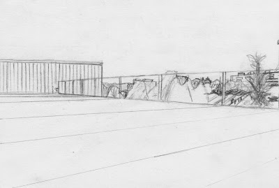
I haven't been in Kansas City long enough to have established a true favorite place, but I tend to favor the quiet and the serene. This place is both. I very seldom cross paths with anyone else up here. The immediate area is so clear, simple, untaxing, that it is one of the few places where I can just let my mind go blank. And with nothing overhead, it is just me and the open sky.
Subscribe to:
Post Comments (Atom)


The trees look like beams of light, was that intentional? Also great job on the perspective on your second piece. It really gives you this sense of space and complements to the clear sky above. Looks like a very nice place to relax.
ReplyDeleteConcept:
ReplyDeleteExtremely interesting. I'm mostly engaged with the temple image, as it poses the most questions to the viewer. The text is excellent in that it helps bring the mystery of the image into focus without giving everything away. The minimalism of the second image is also an effective translation of what you experience in that space.
Composition:
Both images are relatively sparse, but make good use of depth. The framing of the temple image could be slightly tighter, with a little more activity in the foreground area. Only because the image is so intriguing and makes good use of the space...it would help to give a sense of enclosure if the nearest part of the frame weren't so "open" feeling. For example, if you had pushed-in a little bit on your framing so that the trees/columns kept going, in perspective, towards the viewer. You'd have more of a sense of looking in on this mysterious/spiritually charged atmosphere.
The minimal landscape of the second drawing is spot on!
Detail/execution:
Both images are begging for tonality. Some kind of gradation between lights and darks, along with textural information would only make them even more striking. You do include some texture, but it feels/looks incomplete. You want the world you represent to feel as if it carries on past all four edges of the frame. No matter how abstract, you don't want it to feel "confined" by the frame. Both images do a pretty good job of that, but they are missing a sense of light and contrast.
Following instruction:
Excellent